Showcase of Work
This portfolio showcases a diverse collection of my work, including freelance projects, professional collaborations, and personal design experiments. Each project reflects my commitment to creating user-centered, accessible, and visually engaging solutions across various industries.
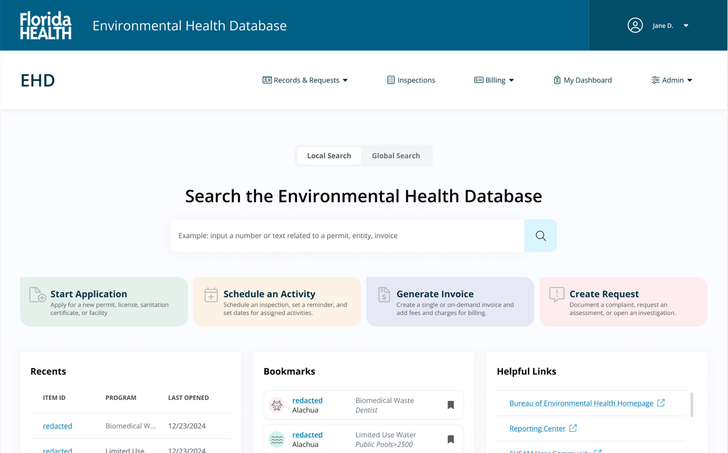
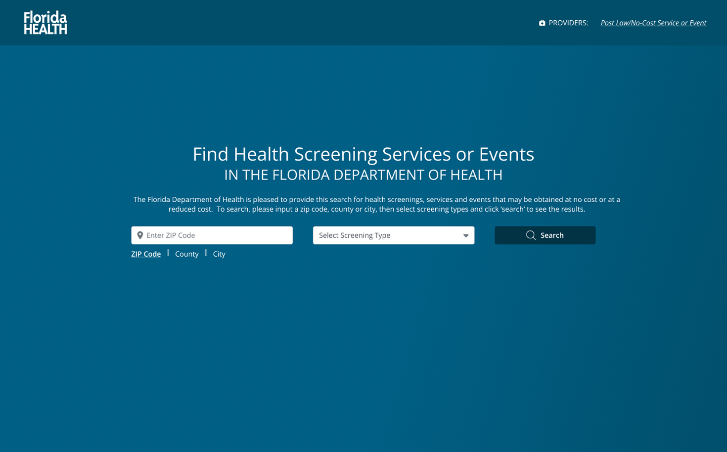
DCHP
The Division of Disease Control and Health Protection works to safeguard public health in Florida by preventing, controlling, and addressing diseases and health threats.
Double Diamond Approach
We began with an audit of existing templates and site architecture to assess the platform’s structure. A recorded interview with the site admin provided insights into user flows, concerns, and improvement areas, followed by a walkthrough demonstration. Findings were analyzed and documented for future design and handoff.
We imported the existing architecture into Figma to reverse-engineer the structure and implement accessibility-first design improvements aligned with Florida Health’s ADA compliance standards. User flows were optimized for efficiency, then visualized through wireframes. After internal UX team reviews, we presented our strategy to the admins, addressing their concerns and refining the approach.
We translated our strategies into low-fidelity wireframes, exploring multiple layout options while ensuring accessibility and core functionality remained top priorities. Designers regularly met to provide feedback and assist each other, refining layouts based on UX lead reviews and user flow testing. Using our design system and component library, we streamlined the mockup process, focusing on functionality without compromising user needs.
Once mockups met admin requirements while maintaining core site functionality, we conducted a final review to enhance usability with improved components. We then coordinated user testing with the admin team, gathering feedback through interviews, surveys, and questionnaires. Insights from testing guided final refinements before handing the designs off for development.
We refined documentation into a concise, developer-friendly format, ensuring clarity on functionality and accessibility. Meetings and recorded walkthroughs demonstrated site interactions, with detailed annotations on component behavior. We maintained an open line of communication to address developer concerns quickly.
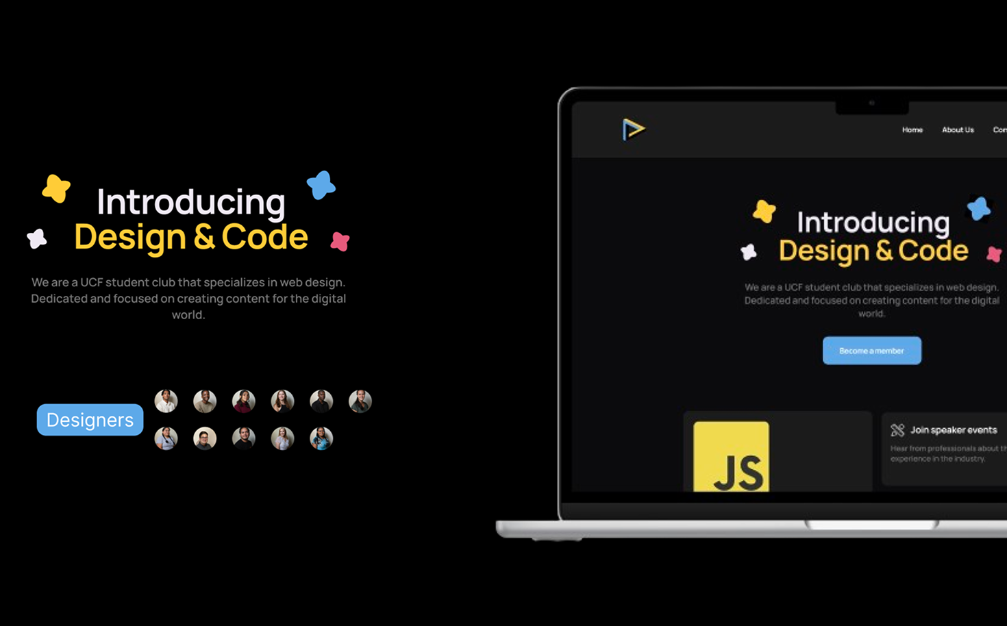
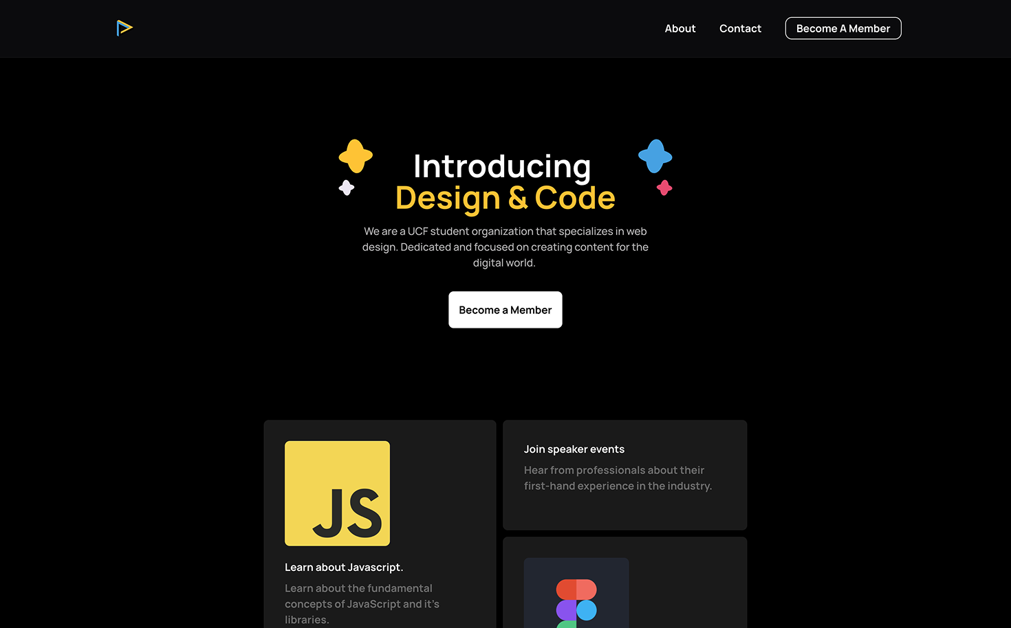
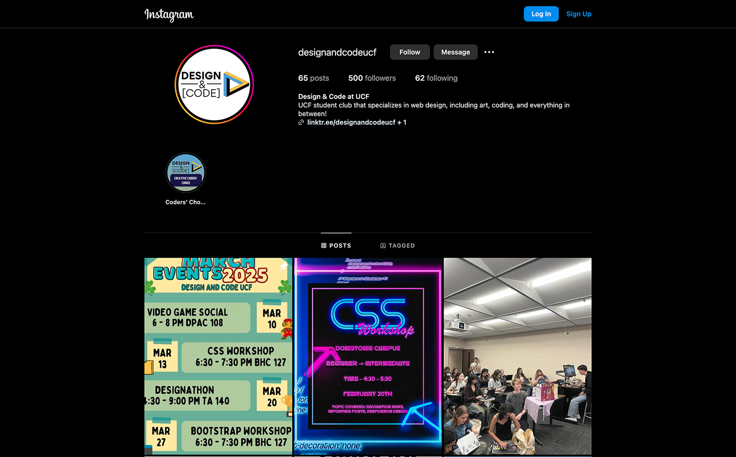
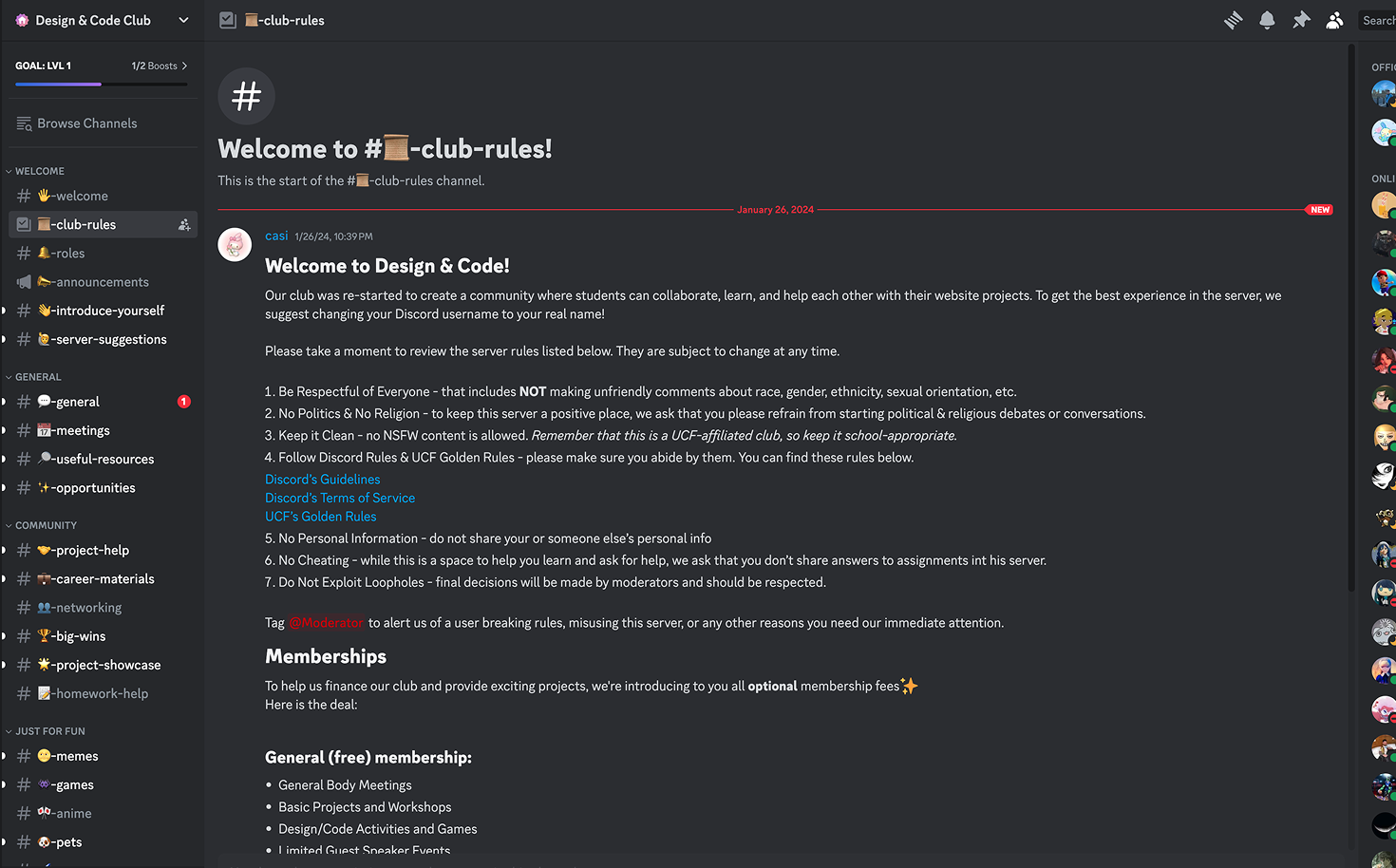
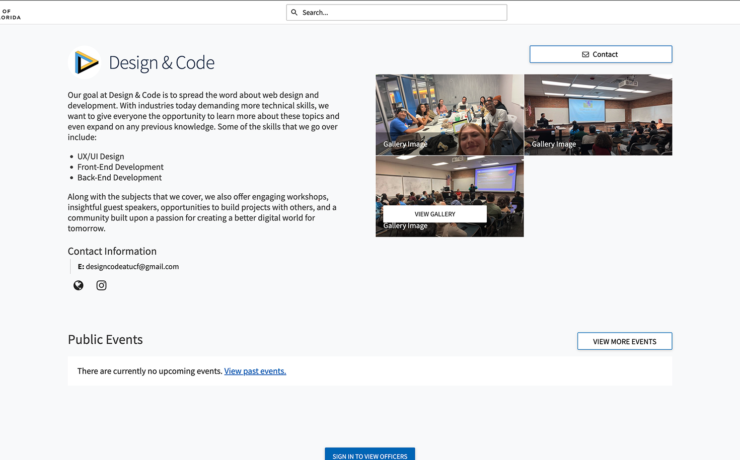
Design and Code Club UCF
Design and Code is a UCF organization that brings together students with a passion for coding and web design.
Design Thinking Approach
We identified a lack of collaboration in our major and sought to bridge this gap. Engaging with students at events, classes, and tabling sessions, we gathered insights on their needs. Through Instagram and Discord, we directly surveyed our audience. Unlike coding-focused clubs, we emphasized the importance of design and development together, attracting both web design and computer science students.
We redesigned the logo to be more modern and vibrant, shaping our brand around the core idea: Design and Code—who we are and what we do. Our website structure focused on introducing the team, engaging new members, and providing resources. We explored various styles, gathering inspiration from existing sites and refining our approach through team discussions, faculty input, and social media feedback to create a design that was both impactful and user-driven.
We designed wireframes with best practices and our core purpose in mind, aiming for a minimalistic, modular layout that would be easy to maintain for future students. Navigation was kept straightforward, catering to a tech-savvy college audience. After exploring multiple ideas, we refined our approach, ultimately .
We transitioned wireframes to high-fidelity designs, following our style guide to maintain consistency. A design lead oversaw production, approving components and ensuring alignment with our vision. After refining designs through internal reviews, we finalized mockups and worked closely with developers to ensure a smooth transition into development.
During development, we closely collaborated with developers, ensuring designs were feasible and aligned with our skill set. As components were built, we reviewed them on the local network to verify consistency with the original designs. Designers acted as test users, identifying and refining any issues before finalization, ensuring a seamless transition from design to deployment.
Design and Code Club UCF
Design and Code is a UCF organization that brings together students with a passion for coding and web design.
Design Thinking Approach
We identified a lack of collaboration in our major and sought to bridge this gap. Engaging with students at events, classes, and tabling sessions, we gathered insights on their needs. Through Instagram and Discord, we directly surveyed our audience. Unlike coding-focused clubs, we emphasized the importance of design and development together, attracting both web design and computer science students.
We redesigned the logo to be more modern and vibrant, shaping our brand around the core idea: Design and Code—who we are and what we do. Our website structure focused on introducing the team, engaging new members, and providing resources. We explored various styles, gathering inspiration from existing sites and refining our approach through team discussions, faculty input, and social media feedback to create a design that was both impactful and user-driven.
We designed wireframes with best practices and our core purpose in mind, aiming for a minimalistic, modular layout that would be easy to maintain for future students. Navigation was kept straightforward, catering to a tech-savvy college audience. After exploring multiple ideas, we refined our approach, ultimately.
We transitioned wireframes to high-fidelity designs, following our style guide to maintain consistency. A design lead oversaw production, approving components and ensuring alignment with our vision. After refining designs through internal reviews, we finalized mockups and worked closely with developers to ensure a smooth transition into development.
During development, we closely collaborated with developers, ensuring designs were feasible and aligned with our skill set. As components were built, we reviewed them on the local network to verify consistency with the original designs. Designers acted as test users, identifying and refining any issues before finalization, ensuring a seamless transition from design to deployment.
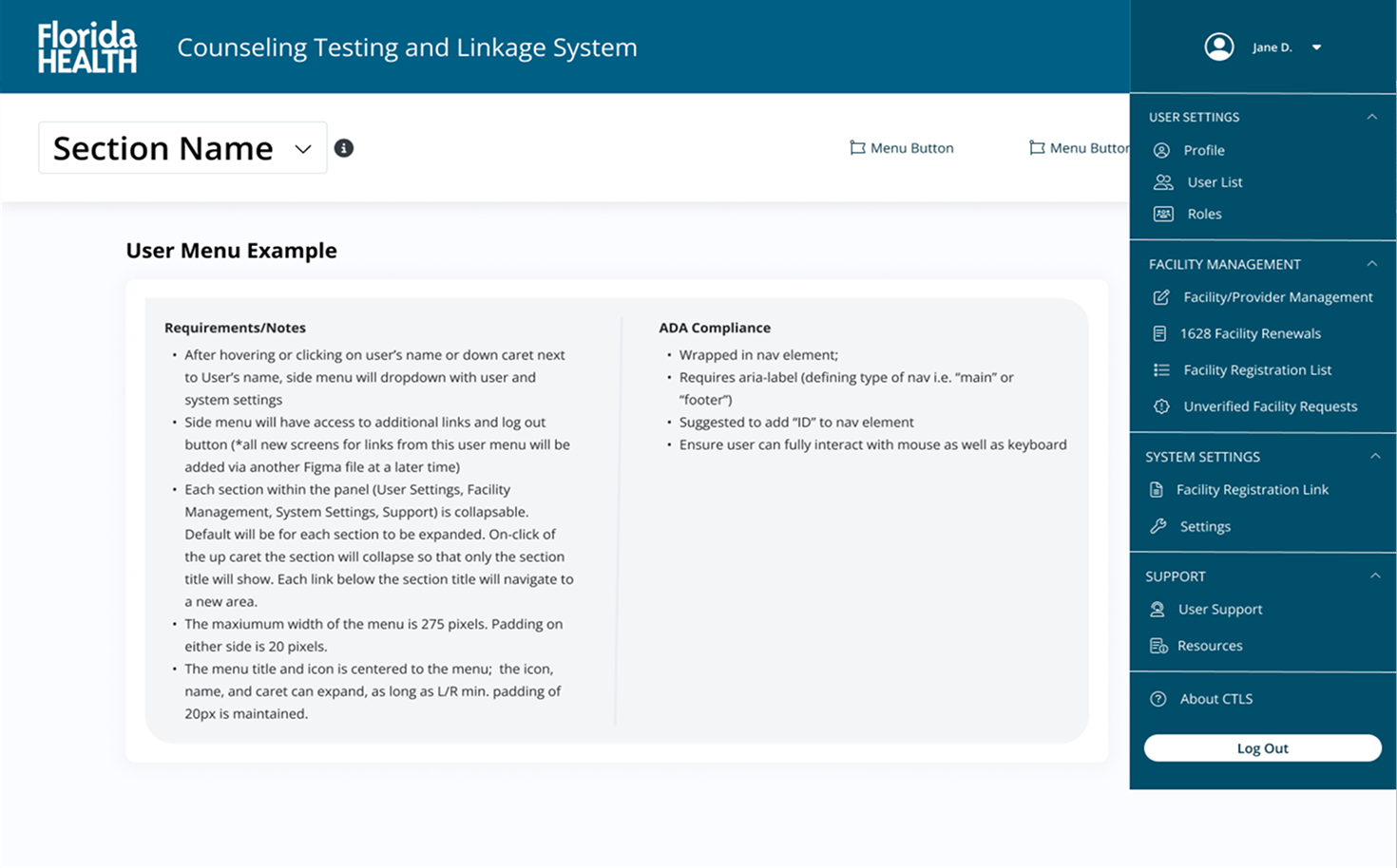
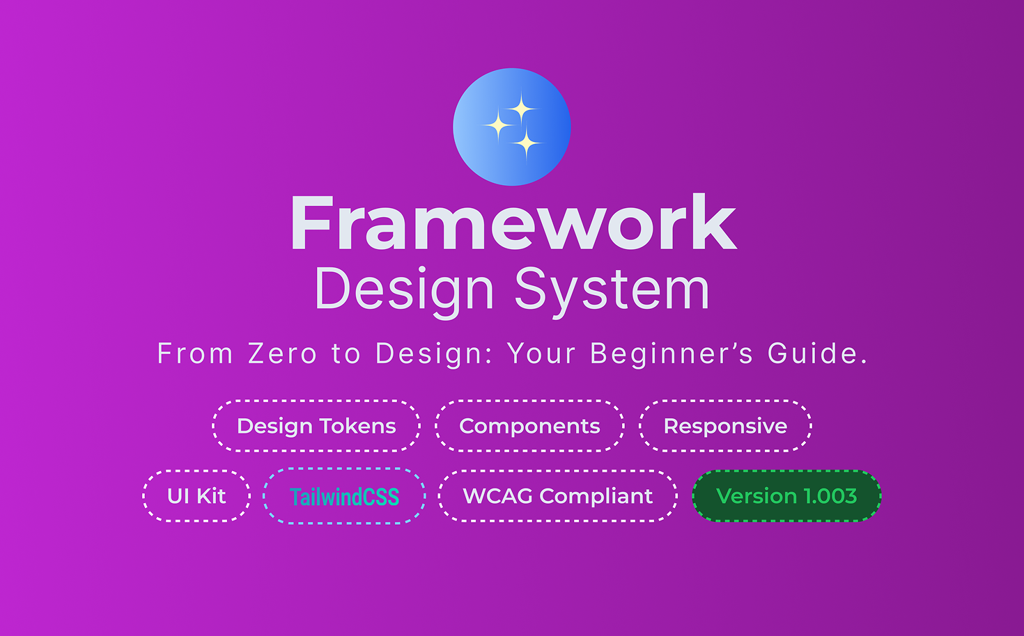
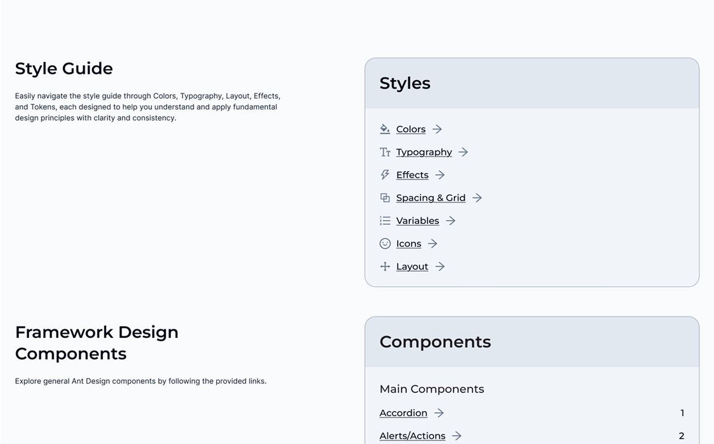
Framework Design System
Designed as both a learning resource and a demonstration of my expertise, it offers essential components, guidelines, and flexibility to help new designers build confidently.
Atomic Design Approach
The foundation of my design system is built on Tailwind CSS, chosen for its scalability and growing industry adoption. I structured the color palette, typography, spacing, and layout principles based on Tailwind’s utility-first approach, ensuring consistency and adaptability. These atomic elements serve as the core building blocks for my system, enabling a streamlined and modern design workflow.
I prioritized variety and modularity, ensuring each component could adapt to different scenarios. Form fields, for example, were designed with multiple states (default, textarea, standard) and various statuses (error, success, hover, disabled). Components were built with high adaptability, allowing users to swap icons, toggle features, and customize layouts, ensuring flexibility while maintaining consistency.
I focused on modularity and flexibility, using slots to let users swap instances within the library. Copy blocks were created with multiple sizes, alignments, and styles, ensuring adaptability across various layouts.
Templates are an ongoing development, expanding as I work on real-world projects. This design system is a continually evolving resource, refined throughout my career. The Table section currently has the largest template collection, leveraging my experience from Florida Health DCHP to create structured, adaptable layouts.